After seeing the last Apple commercial, I wondered what other people thought. Sadly, I came across this: In 20 Years, We’re All Going To Realize This Apple Ad Is Nuts. I cannot tell if the author is:
- trolling.
- biased because he is an anti-Apple fanboy.
- just utterly clueless.
The subtitle should be, “In 5 minutes, we’re all going to realize this author is nuts.” Here is his mind bogglingly misguided article:
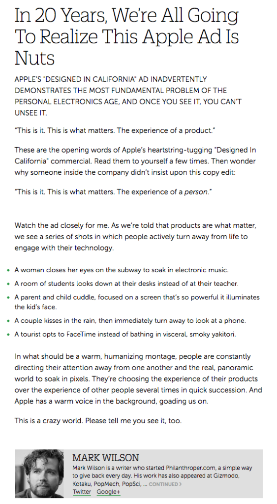
“The experience of a product” is correct. We know a product does not feel anything, thus the implied sentence is “The experience of a product by a person”.
His core point of “people actively turn away from life to engage with their technology” is easily dissectible point by point:
A woman closes her eyes on the subway to soak in electronic music.

People listen to music in different ways. Sometimes with thousands of other fans, sometimes in solitude at home, and yes, sometimes via headphones in public. The author’s implication is that Apple is responsible for turning people into anti-social music consumers. Walkman? Or maybe the author thinks all music should be externalized because everybody on that subway train should share the experience. Boombox?

http://forums.macrumors.com/showpost.php?p=14083514&postcount=23
The listener is not turning away from people to interact with technology. The technology is irrelevant. The objet de désir is the music, regardless of how it is delivered. And how does the author know she is listening to electronic music? She could be listening to [gasp] an analog cello solo. Music is not electronic merely because it is delivered by a digital device.
A room of students looks down at their desks instead of at their teacher.

I do not know what school the author went to, but in every school I have seen, students work on problems in class. They do not merely sit there and listen to a teacher lecture all day. These students are clearly working on something and (conveniently omitted by the author) enthusiastically raise their hands once they have completed the task or solved the problem. Note, these are chalkboards, not iPads:

http://ukfrey.blogspot.com/2012_02_01_archive.html
A parent and child cuddle, focused on a screen that’s so powerful it illuminates the kid’s face.
 A candle would similarly illuminate the child’s face. The author is clearly desperate now and taking details out of context. The point of the scene, which the author shows a shot of but neglects to discuss, is the child’s reaction. As a father of three, I know that wonderment well and it never ceases to amaze me. Also, the screen is not all that bright considering the darkness of the room.
A couple kisses in the rain, then immediately turn away to look at a phone.

Wow, really? This is when I began to wonder if the author is a complete idiot. Has the author never possessed a camera, let alone a phone with a camera? The couple is taking a photo of themselves together. Like, duh. Again, the author must think that Apple (and theoretically any company with a product that has an imager) must be evil for enabling people to capture a moment of their lives, during which they are ignoring the world around them.
A tourist opts to FaceTime instead of bathing in visceral, smoky yakitori.

Again, the author takes a point in time out of context and neglects to mention that the tourist was showing live video of the yakitori to his friend via FaceTime; something that was not possible for the masses until very recently.
The author also left out the next two segments which show [more gasps] plenty of inter-human interaction. Then again, both show people fixated on content sourced from a Mac so I am surprised the author did not slam them too.


The amazing thing about this Apple commercial is that it is not about Apple. You can substitute a Google, Samsung, or Microsoft device into every scene. The experience may be different (better or worse is up to personal taste), but the functionality would be similar. As I said in my previous post about this commercial, technology, sufficiently perfected, seamlessly becomes a part of our lives. Suddenly, we can do things that seem perfectly natural but were not possible a short time ago. We do not become brainiacs though Google, Wolfram and Siri help us answer questions a lot faster. We cannot transport to another planet but FaceTime, Hangout and Skype let us interact with somebody on the other side of our planet near instantaneously. If somebody so chooses, they could stay at home and play Minion Rush all day without interacting with anybody. But if these devices did not exist, that person would have found something else to do alone.
After writing this, I realized that the author is probably all three… a clueless, fanboy troll. What a sad life he must lead if he actually believes what he wrote. I hope he doesn’t and wrote that article just to drive up hits.


 A candle would similarly illuminate the child’s face. The author is clearly desperate now and taking details out of context. The point of the scene, which the author shows a shot of but neglects to discuss, is the child’s reaction. As a father of three, I know that wonderment well and it never ceases to amaze me. Also, the screen is not all that bright considering the darkness of the room.

